How to create good web design. EVERYTIME.
All web design is composed of four elements.
- Text
- Empty Space
- Images / videos.
- Geometric objects (your button, tag enclosures etc.)
A good designer is the one who knows how to choreograph the dance between the 4 elements in a way that makes sense to the audience.
But, how do we even start ?
Looking for references on pinterest or dribble is easy but before we go on typing on our search bars, it is important to learn 2 concepts —
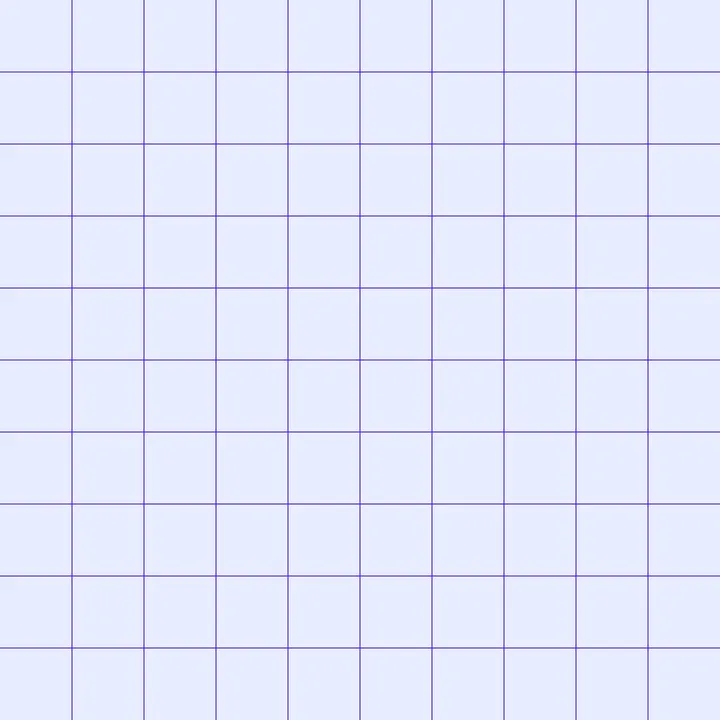
1. The grid
The grid helps navigate the white space of our artboards and more importantly determines how and where we would place our elements. Grids can range from simple squares to complex ones with columns and gutters.

2. Rhythm
Think of rhythm as pattern repetition. It could be as simple as repeating elements in regular intervals and as complex as trying to mimic rhyming schemes in poetry.
Note that rhythm is not limited to repeating shapes and patterns. It could also be done with colors, sizes, typography and any element or combination of elements in your design.

Let’s try to create a poster.
For simplicity, we will limit ourselves to circular dots, two text sizes and a basic square grid.

1. First, let’s think about rhythm.
Let’s start with something simple (A,B,A,B) and think of ways to make it interesting.
Remember, how you determine your rhythm will depend on what you decide to draw inspiration from. The more time you spend in this step, the better your results.

While the pattern above looks fine, let’s think of making it less obvious to the viewer. We want the pattern to register on the viewer’s subconcious.
What if we made the second set of A, B inverted/mirrored ?

As you can see, the pattern looks just random enough to generate intrigue.
2. Now, let’s put our dots on the grid.
To make space for text, we will get rid of the stroked circles.

We can now see clear white spaces for our text to fit in.
3. Finally, we add text.
For adding another level of rhythm, we are going for small text, followed by big text and another block of small text. We can then place them in the white space provided by our dotted patterns.

4. Can we add another level of rhythm using color ?
Let’s try to do it, but keeping in mind- we want to draw attention to the content that is included in our poster.
We will color the first dot in pattern ‘B’- green. The same green will appear again in ‘B mirrored’ near to the paragraph text.
Finally, here is our final product.

Conclusion:
There is no standard rulebook to create good design, else every design would look the same. While it is important to follow rhythms and think of design analytically, we must also remember to make our design human (breaking rules where we deem necessary). I would argue that most web design currently look same because the thought leaders at big tech have all created easily accessible design systems, making it easier for us to rip off of them. However, this results in design that looks suspiciously similar to everything else that exits on the web.
As designers we must strive to create our own recipes and flavors that stand apart in the crowd. This can only be achieved if we understand the basics, practice more, and think more about the foundation of what makes good design.


.jpg)