Watching movies and how it helped me become a better designer.
I remember watching “Moonrise Kingdom” one summer in my college dorm. I was in awe at how visually symmetric the movie felt. Every object/prop/character in the movie felt like it belonged to the story.If you ask me to quote the film today, I probably would fail. But I could describe you it’s scenes in vivid detail.
Perhaps it’s the influence of my trade. But I have always loved movies that are visual. I am amazed every time I can understand a scene, without having to listen to the dialog.
Take for instance this scene from my all time favorites — “Tokyo Story”.
Two women greet each other.

You don’t need to watch the movie to understand that the friendly women are equal to each other within the story’s context while, at the same time, one of them is an important character.
It does not feel co-incidental, neither does it feel like the result of an artist painting with his subconscious.
It feels strategic.
The invisible grid on a scene.
If we squint our eyes on an interesting scene in a movie, we can always draw a grid that would make sense. On trying to draw a modular grid on the picture above. We begin to uncover answers to why we could understand the relationship between the characters with ease.
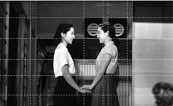
See how the smiles line up on a horizontal line and so does the shoulders.
The woman on the right is placed between the two black square objects on each side of her head, signifying that she must be more important to the story.
Let’s take another example from the same movie:

See how the eyes and forehead line up exactly on the electrical grid lines running on the background.

“Tokyo Story” much like other Asian movies from the era has many such examples sprinkled throughout its runtime.
You could in-fact pick any Wes Anderson or Kubrick film today and end up with grids like these.
But how did studying invisible grids in movies make me better in design ?
In web design (and interface design in general), we deal with a combination of imagery and typography.
Years of creating digital objects and moving them around on artboards, has made me come to the realization that all I have been trying to do is — to tell a story visually. I have learned to see blocks of texts, headings, buttons, images and interactions as props on my visual storyboard.
In the 3 points below I try to demonstrate what I learned.
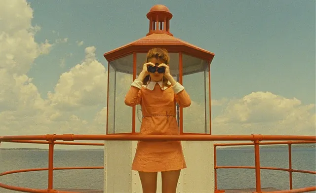
1. Alignment is simple, but subtlety is the trick.

On first glance, building this might look pretty simple. Just make a block, with text and an input box inside, align them to the center of the background image and the job is done.
But the beauty is in its details.
A closer look reveals that the bottom edge of the search section aligns with the iron bars in the image. The search box too aligns along the solid edges of the watch tower. The “Explore movies” line of text aligns roughly to the shape of the girl on the background as though it is an extension of her arms holding the binoculars.

2. The eyes and shoulders are important
Time and again, we have seen that in visual stories involving people, the eyes and the shoulders play a vital role.

In the example above- I placed the heading along the line of sight of the girl. I also placed the button along the alignment of the shoulders. See how the layout looks balanced even if the objects aren't really placed in an orderly fashion.

3. Lines of text are just grid lines if you squint hard.
Lines of text can do more than just tell the story. They can also act as guides to the grid lines on our artboard.

In the example above, the line-height of our heading is roughly same as the height of the brick on the background. The paragraph too has a line height, half of the height of a brick. See how the card feels as if its an integral part of the brick layout background ?

Close attention to visual details (the grid laid out by the bricks in this case) can make your objects come together as a singular being within the storyboard.
Conclusion
Design writers and influencers today will have you believe that a grid is this lifeless element we can use to align our objects. In-fact, designers won’t even bother most of the time. “Your grid should be 8 pixels and you would need gutters 16 px wide to make a website and and for more inspiration — just explore dribble and be done with it.”
As designers we often tend to forget our over arching purpose. We must remember — all we are trying to do is tell a story. Minor details aside, how we create harmony or tension between our objects is how we tell half of it.


.jpg)