What should be the size of an icon button?
In our very first article, we try to explore the comfortable range of sizes in which designers can experiment with the size of icon buttons. We also dive into how size can be used to guide users to the most favorable actions.
1. Touch Target
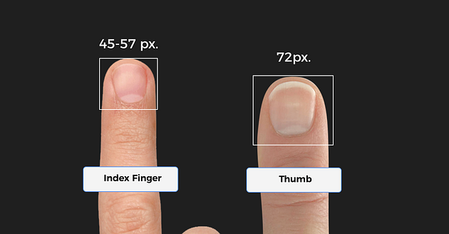
Interaction with buttons on desktops (and to a large extent on laptops) are done using mouse cursors. Hence button sizes could possibly be smaller. The problem arises when we encounter touchscreens. We use our fingers to interact with touch screens. Thus the size of our fingertips (index finger and thumb) decides how small an icon button could possibly be to effectively serve its purpose.
An MIT study found that the average width of an index finger is 45–57 px and the avg size of the thumb is 72 px.
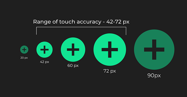
2. Touch Accuracy
Too small icons might be difficult to target, while too large icons might confuse users as to where exactly to touch to successfully complete the task.
The same MIT study also found that that touch accuracy is low below 42 px and above 72 px.
3. What do design systems say about button sizes?
Design systems are a very good source to understand acceptable size limits. Material Design prescribes an icon area of 24 dp and a touch target of 48 dp (1 dp = 1 px for a screen of size 320 X 480 px). Similarly, apple suggests 44 pts (1 pt = 1.333 px)

We could thus comfortably say that the safe limits of icon button sizes lie between 42 -72 px. However, we must remember that it is always advisable to follow the specifications prescribed by the OS we are designing for.
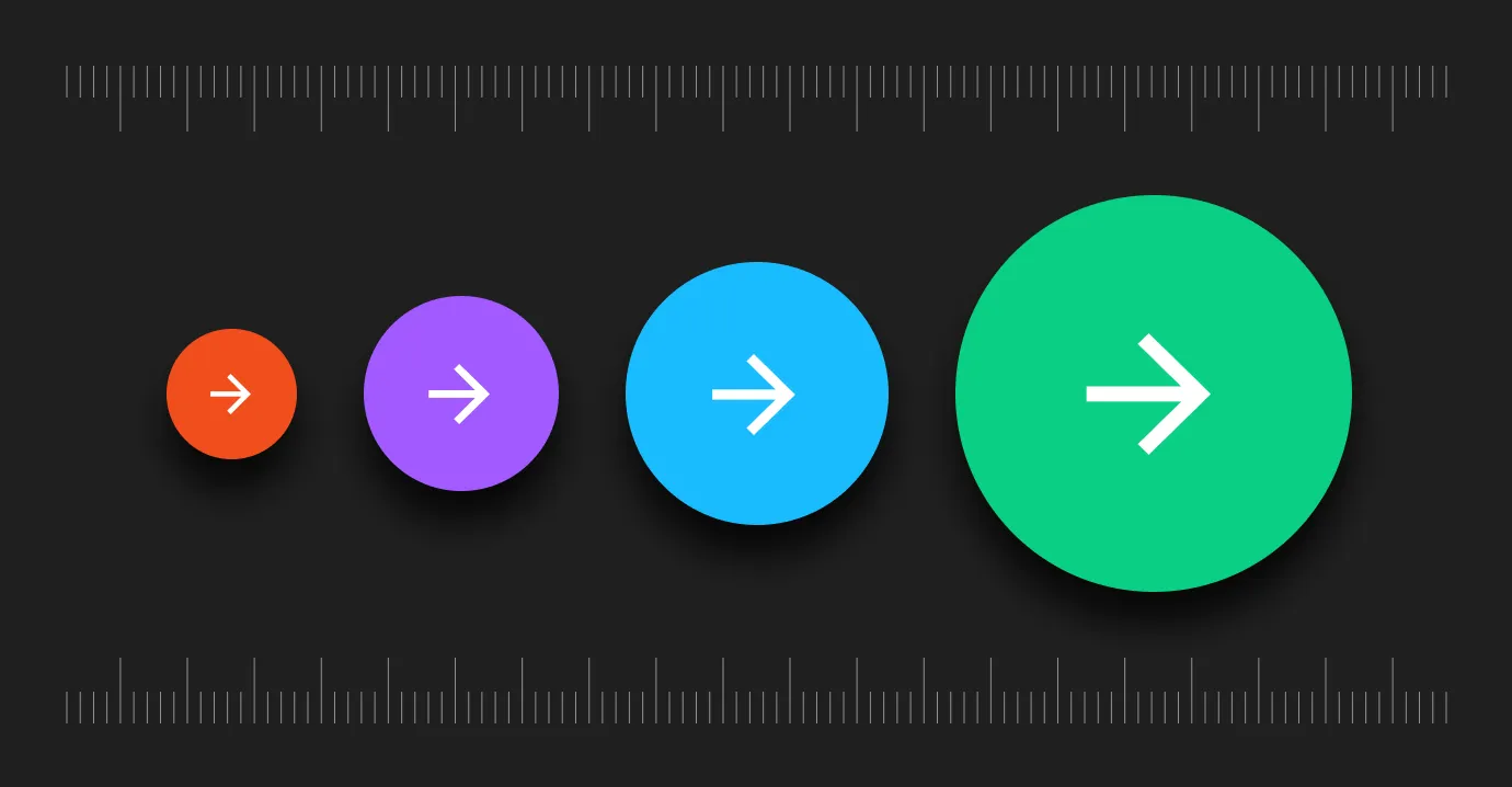
But should all buttons be of the same size?
Short answer- No, Hierarchy is important.
Hierarchy
When we are designing a number of icons together, there are always icon buttons that are more important than the ones around them.
The size of a button in a set of buttons helps guide the user to the most important action!
Thus, while designing many icon buttons together, varying sizes can help guide the user to the most favorable action.

Here is an example.


.jpg)